
My Role
Figma, Photoshop
Prototype

The problem:
The Background
Relies heavily on traditional methods of communication and fundraising, which limits its reach and effectiveness.
Research
I conducted a secondary research to understand what users want in a charity website and the pain point they face
User Expectations
Ease of Use and Navigation
Compelling Content
Secure and Versatile Donation Options
Mobile Optimization
Transparency and Detailed Information
Pain Points
Complex Donation Processes
Poor User Interface Design
Insufficient Engagement Opportunities
Lack of Updated Content
What specific features and functionalities do you most value in a charity website?
"I value clear information about how my donations are used. I also appreciate a simple, quick donation process with multiple payment options."
"I look for transparency in financial reporting and updates on projects. An easy way to sign up for volunteering opportunities is also important to me."
"I will appreciate a simple, quick donation process with multiple payment options."
What are the main obstacles you face when attempting to donate or engage with a charity online?
"Complicated donation forms with too many steps can be frustrating. I’ve abandoned donations before because of this."
"It’s hard to find updated information on some charity websites. If I see outdated content, I assume the charity isn’t active or effective."
Goals
Frustration
I identified exactly what the learners were facing.

Don’t want a complex donation processes

Want detailed information regarding how my donations are utilized

Want to be able to volunteer

Want engaging content that tells the stories of their works

Want the interface be ease to use

Difficulty finding social proof to validate the charity impact
I discovered major constraints during my research.
Ideation

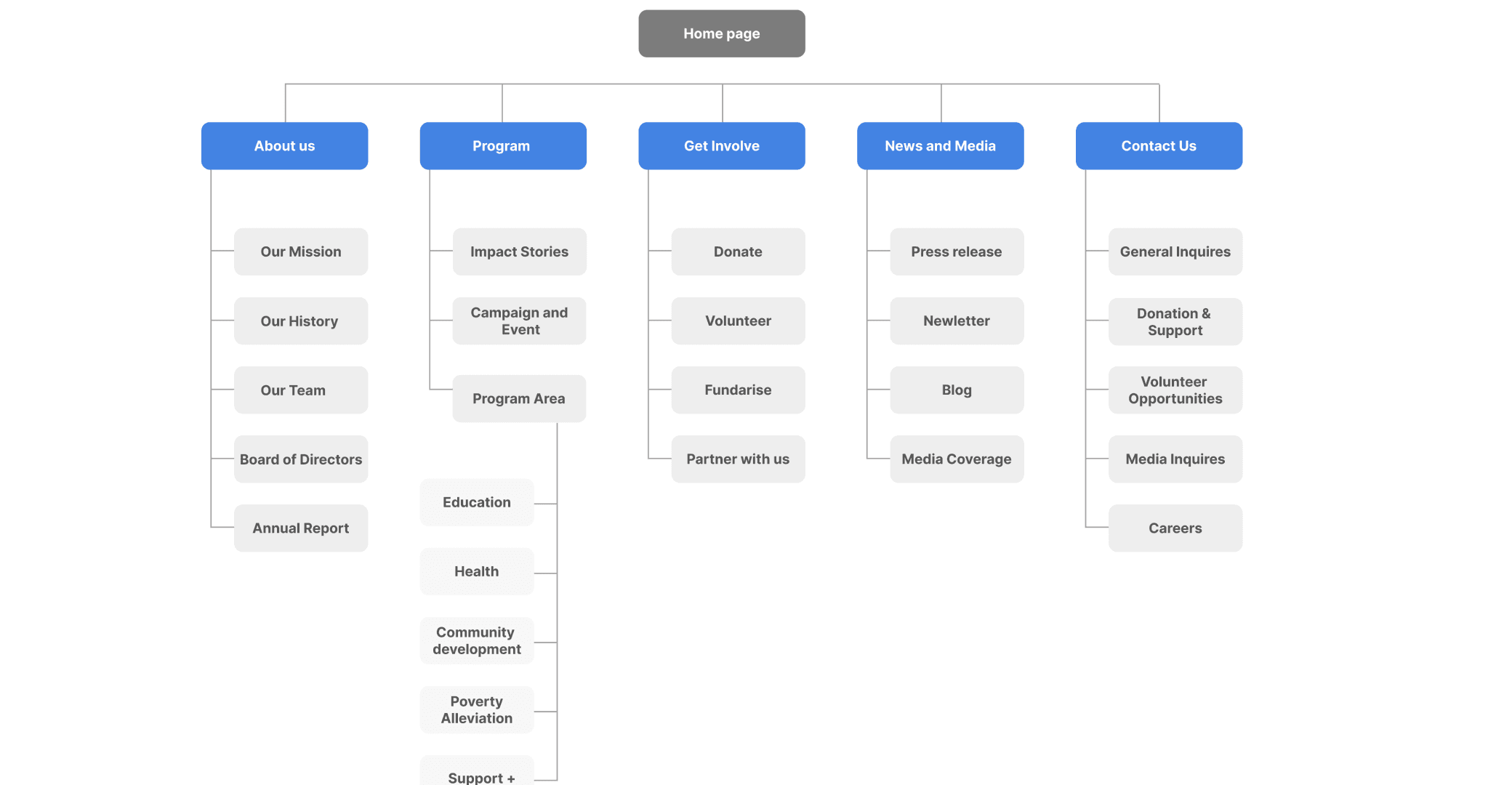
Wireframing:
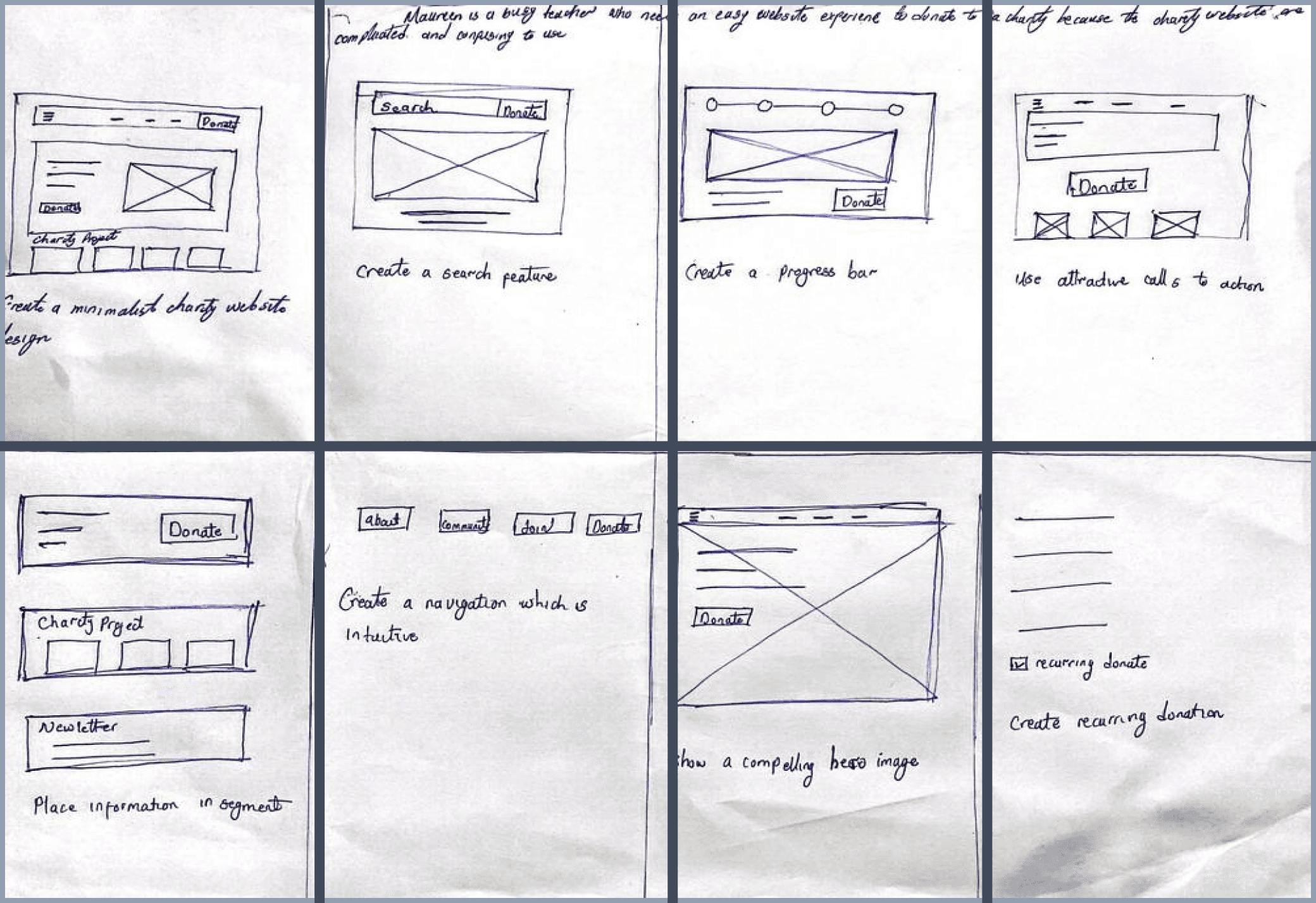
Sketches & low fidelity mock up
Rapid sketching allowed me to explore design patterns common among website in the competitive landscape, helping me understand which needed to carry over into Hope charity.


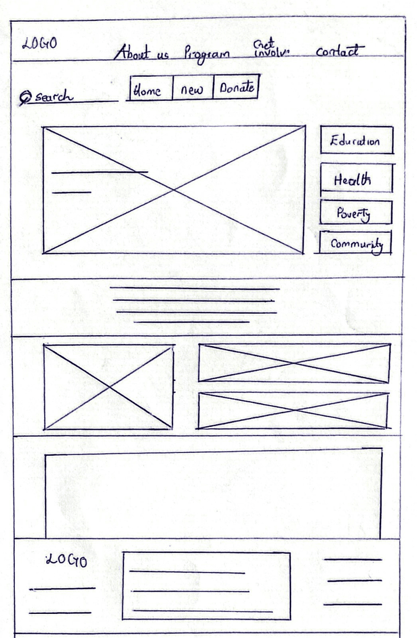
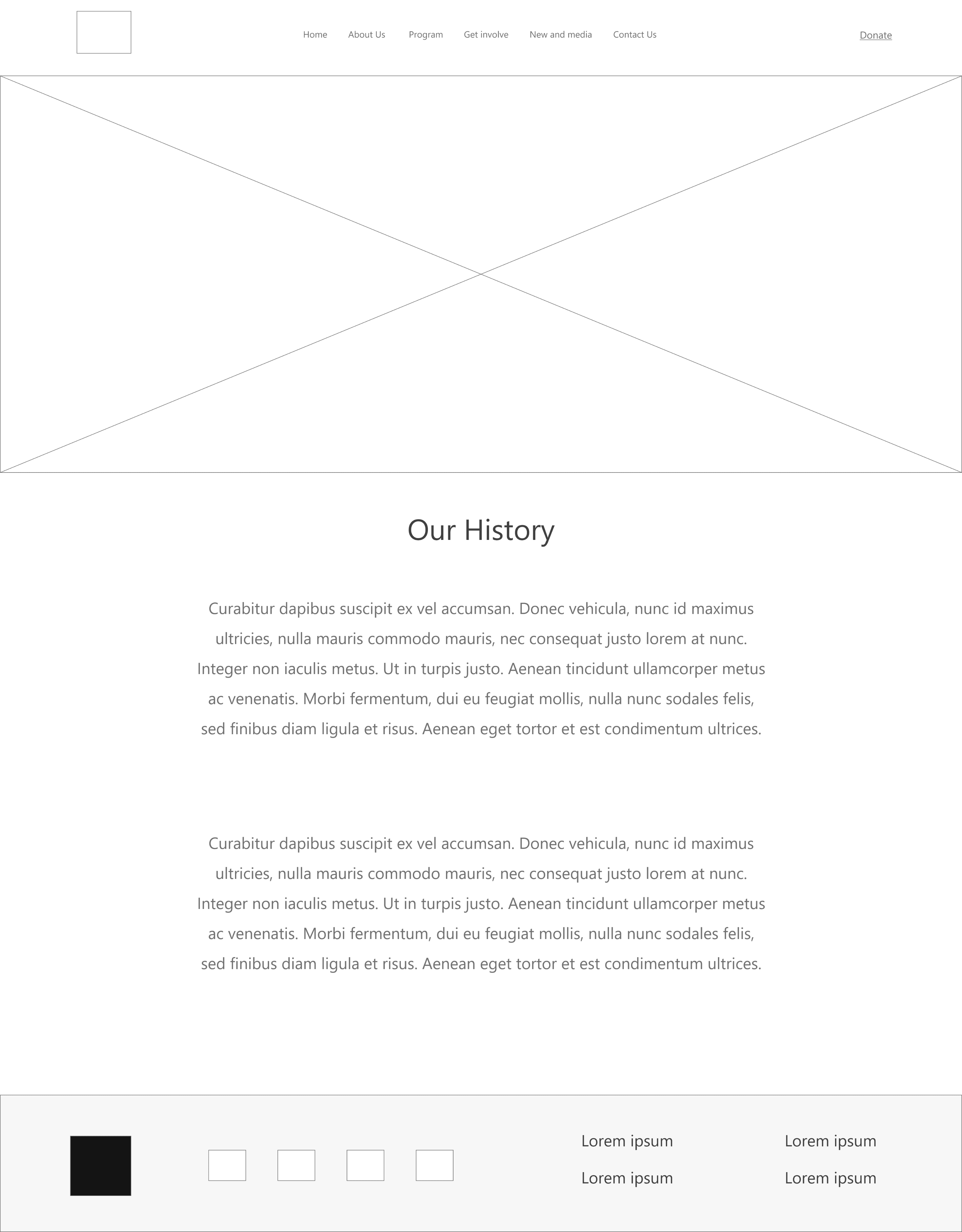
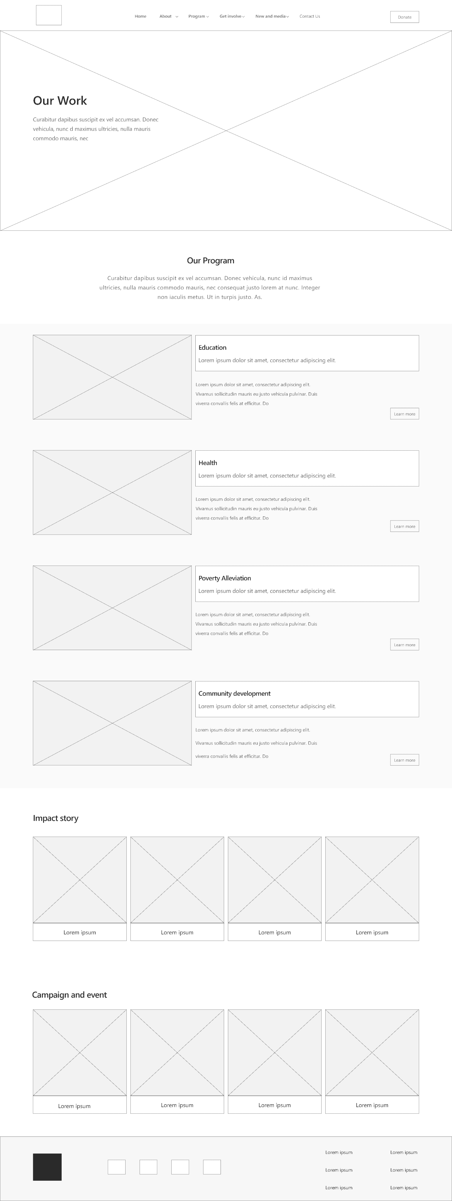
Different paper wireframes for the landing page


Usability Test: was tested with 5 users.
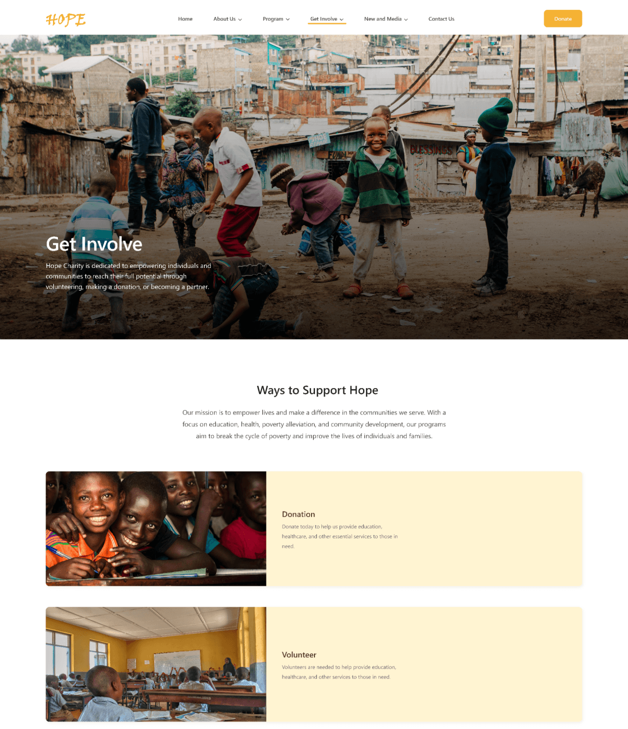
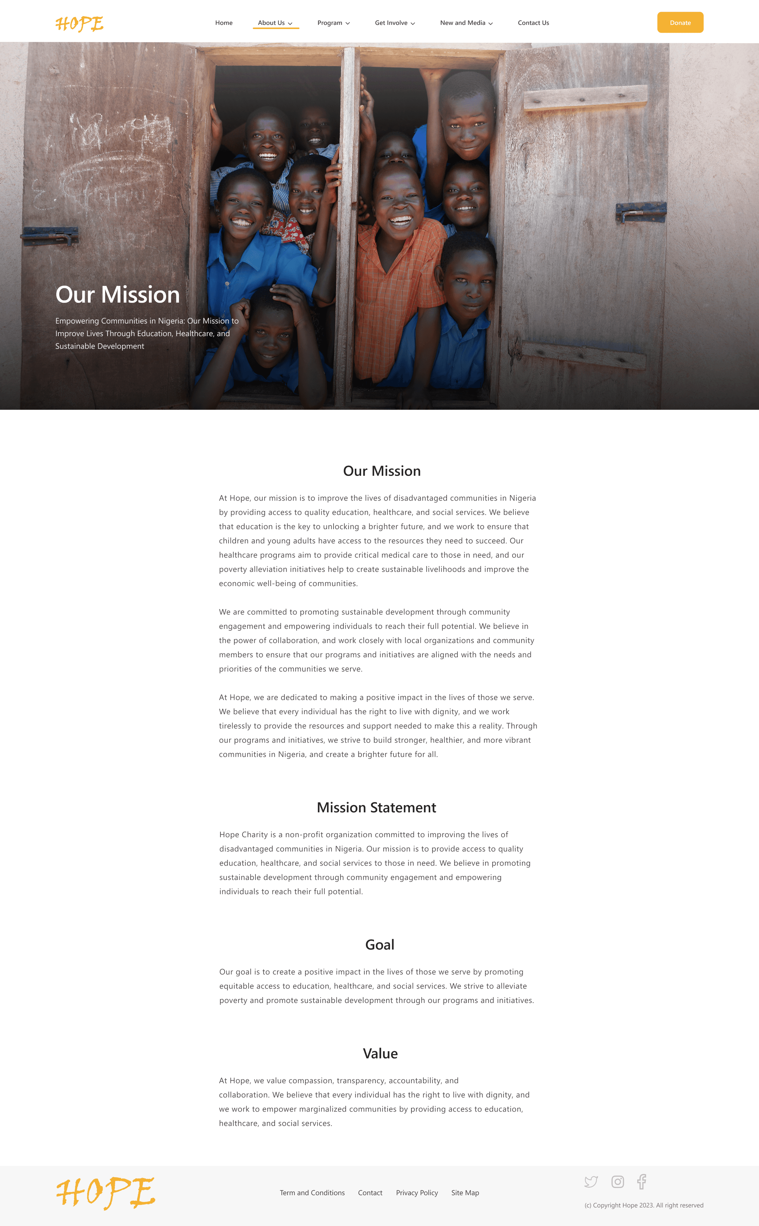
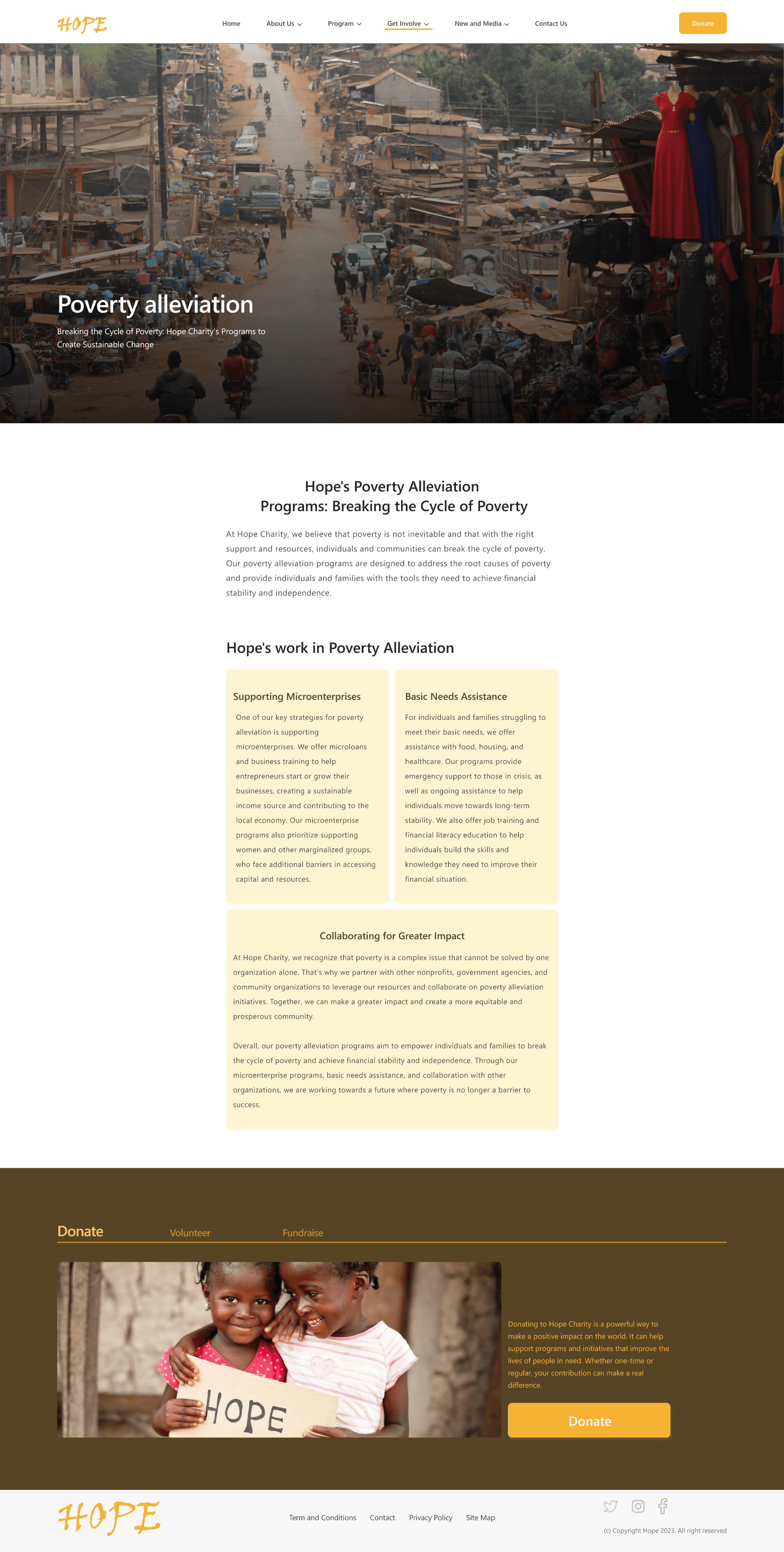
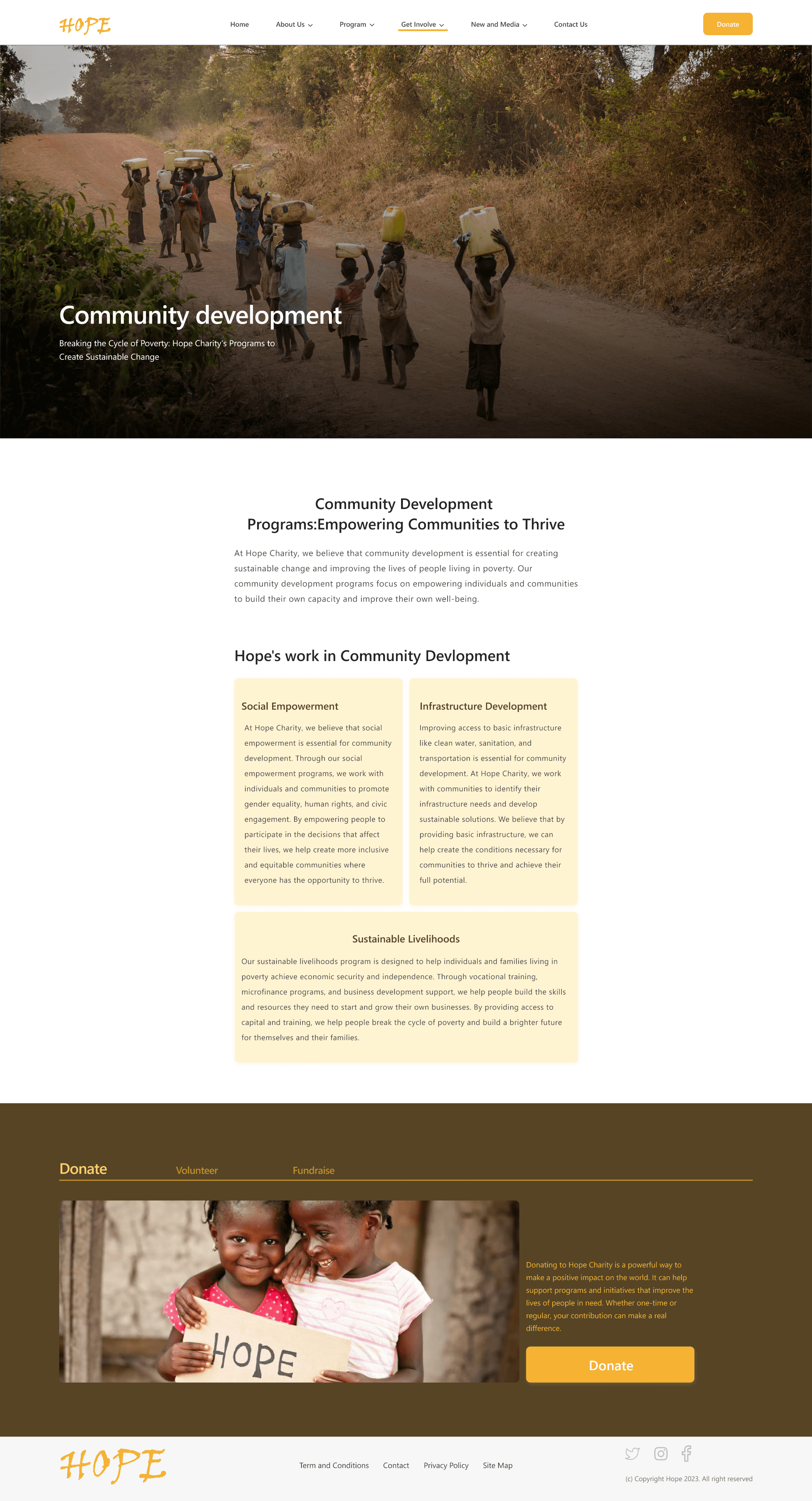
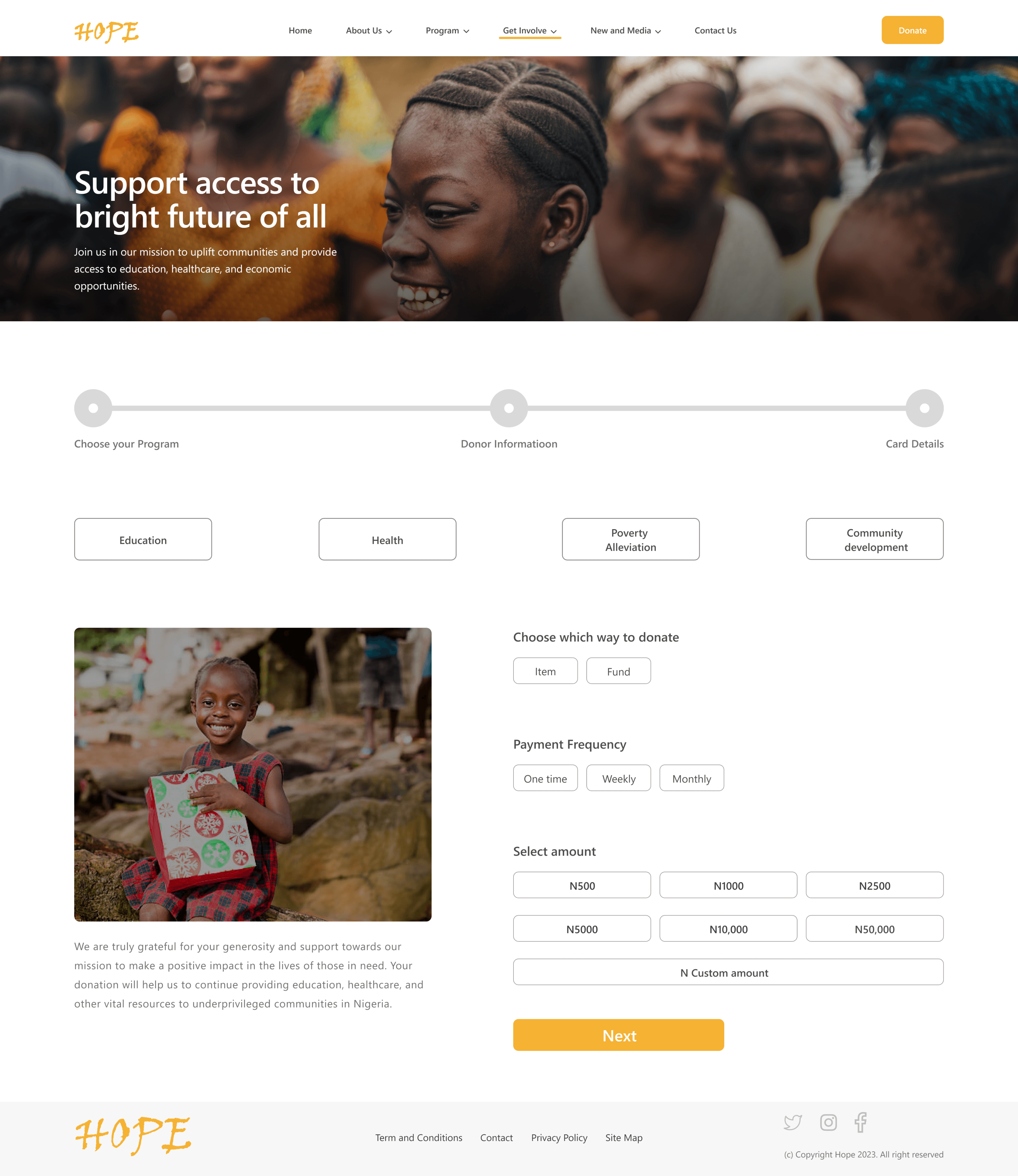
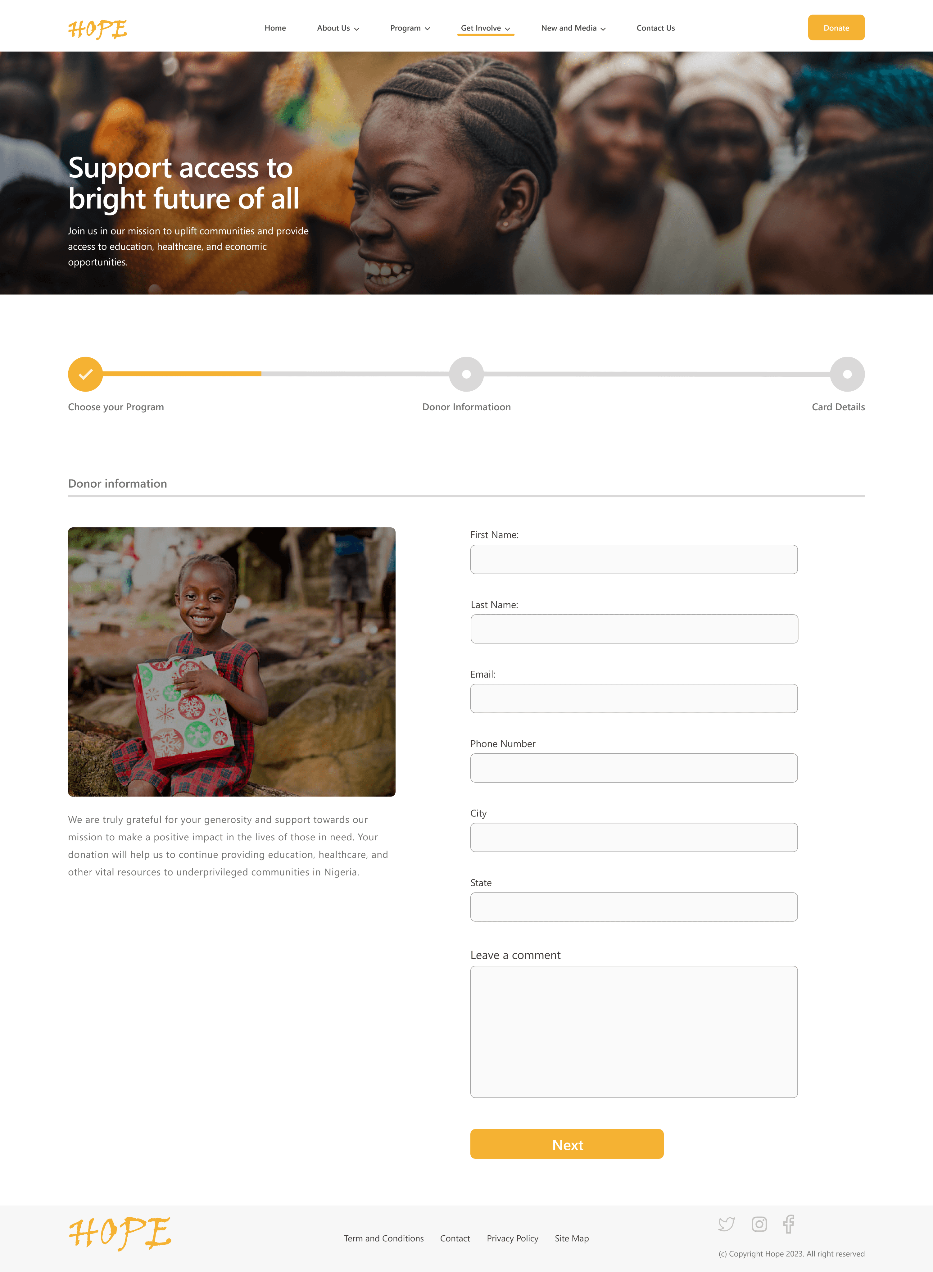
Welcome to Hope charity


Takeaways
Impact:
Our target users shared that the design was intuitive to navigate through, more engaging with the images, and demonstrated a clear visual hierarchy..
What I learned:
I learned that even a small design change can have a huge impact on the user experience. The most important takeaway for me is to always focus on the real needs of the user when coming up with design ideas and solutions.
Next steps


Get in Touch