
Objectives:
Hope Charity is a non-profit organization dedicated to improving the lives of disadvantaged communities in Nigeria. We are seeking a comprehensive visual identity that reflects our mission, values, and aspirations, and enables us to create a consistent and impactful presence in the non-profit sector.
Brand Recognition
Consistency
Differentiation
Versatile
Inclusivity
Credibility
Before starting the overall design process, I made sure to evaluate the brand’s core values and it’s identity.
Strategic Foundation
Core Values
Compassion, Transparency, Accountability, Collaboration
Mission
Committed to improving the lives of disadvantaged communities in Nigeria
Vision
Create a brighter future for all by building stronger, healthier, and more vibrant communities in Nigeria
Target Audience
Donors, volunteers, local organizations, government agencies and international NGOs
History
Hope Charity, founded in 2021, aims to improve the lives of disadvantaged communities in Nigeria by providing access to quality education, healthcare, and social services. Despite initial limited resources, the founders have grown and established partnerships with local organizations and community members. Today, Hope is a respected and influential force in the Nigerian non-profit sector, with a dedicated team of staff and volunteers working tirelessly to build stronger, healthier, and more vibrant communities.
PHILOSOPHY
empowering
Transparent
Inspirational
Transformative
Impactful
educational

NAMING
Hope Charity's rebranding is an evolutionary process; colors is developed from the current visual identity.
Major modifications or evolutionary redesigns may have an impact on the brand's recognition and equity, resulting in a loss of trust from users and partners.
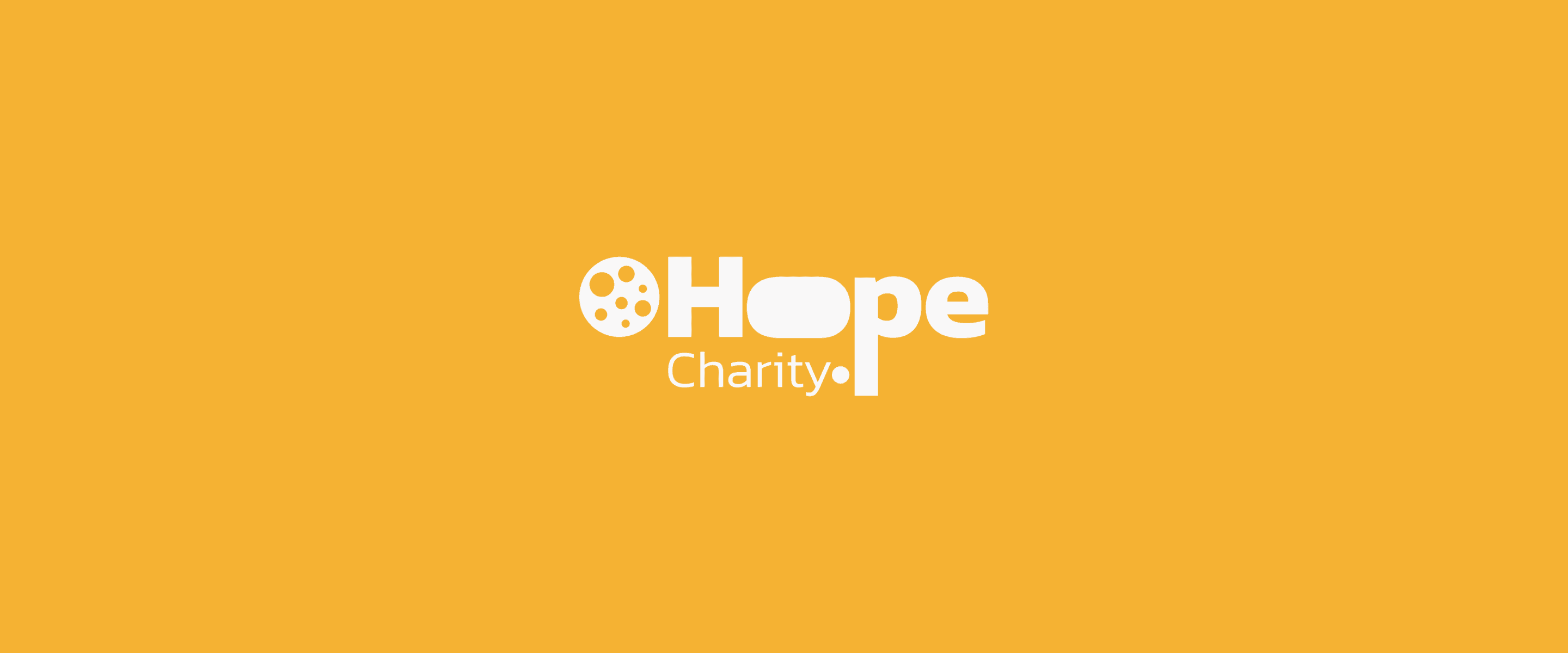
HOPE
Original Logo
It serves as an inspirational emblem, sparking hope and fostering transformative change. The name connects supporters and represents the power of hope and compassion, ensuring a transparent and consistent brand.
But we will change the logo to better reflect the brand identity and to ensure that our visual representation aligns seamlessly with our mission and values. our logo should mirror our commitment to innovation, transparency, and inclusivity
The new logo design will serve as a visual testament to our ongoing efforts to empower individuals and create positive, transformative change
Rebranded Version
Mood Board
In the design phase, I achieves style inspiration and establish a design direction efficiently with the help of mood board. This step makes sure that the brand is set in the right direction.

Logotype
Using the information from the research the brand is modern, innovative, empowering, transparent, inspirational, transformative etc which has to be depicted in the logotype
Examining the letter forms for the logo- type, which means studying the words or the word that represents the company name.
HOPE CHARITY
Hope Charity
hope charity
HOPE-charity
HOPE / CHARITY
hope > charity
p
a
y
p
a
y
Hope Charity
p
a
y
p
a
y
p
a
y
p
a
y
HOPE CHARITY
p
a
y
P
a
y
LETTER SHAPES
Checking typefaces that resonate with the philosophy, that are particularly interesting or relevant to the company
Hope charity
Hope Charity
HOPE CHARITY
HOPE CHARITY
Hope charity
Hope Charity
HOPE CHARITY
HOPE CHARITY
HOPE CHARITY
Hope Charity
HOPE CHARITY
HOPE CHARITY
TYPE SKELETONS
Started customizing the letter forms, creating additional meaning and emphasis, and making them align with the philosophy.
Customizing Letters
Making additional edit to the logotype
LOGOTYPE DEVELOPMENT
Final LOGOTYPE
The logotype at different sizes

Choosing Color
COLOR PALETTE
Its natural optimism and associations with joy and optimism are in line with the goal of the organization, which is to give hope and assistance to underserved populations.
The color palette can help establish strong visual identity that reinforces the company’s values and resonates with its target audience
Primary Color
142162
Secondary Colors
564425
FFFDE9
FECE74
F9F8F8
F9F8F8
CF8E12
876729
332102
1C1201


Logomark


Primary TYPE
The primary type family for Trusty is called Segoe UI
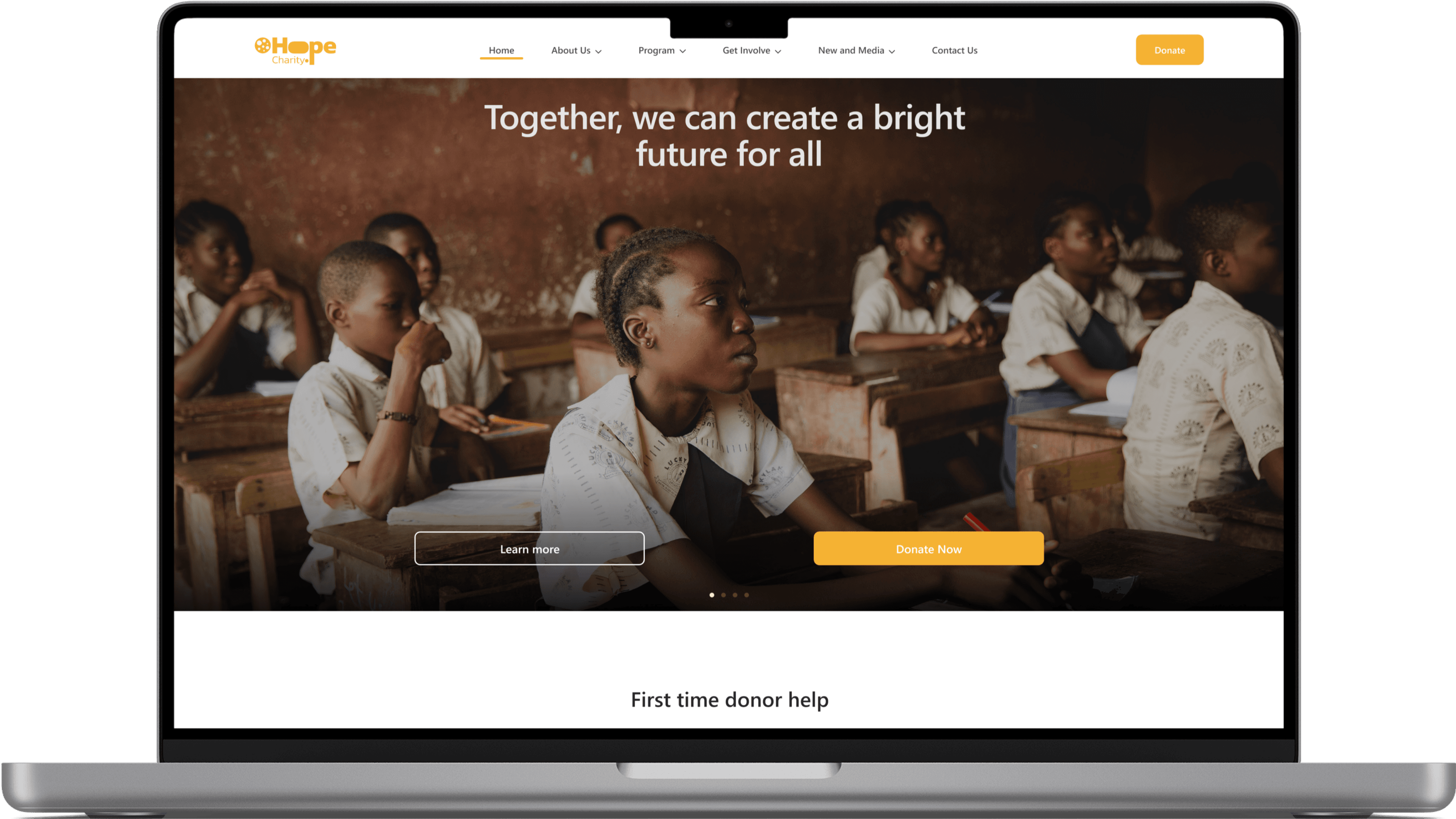
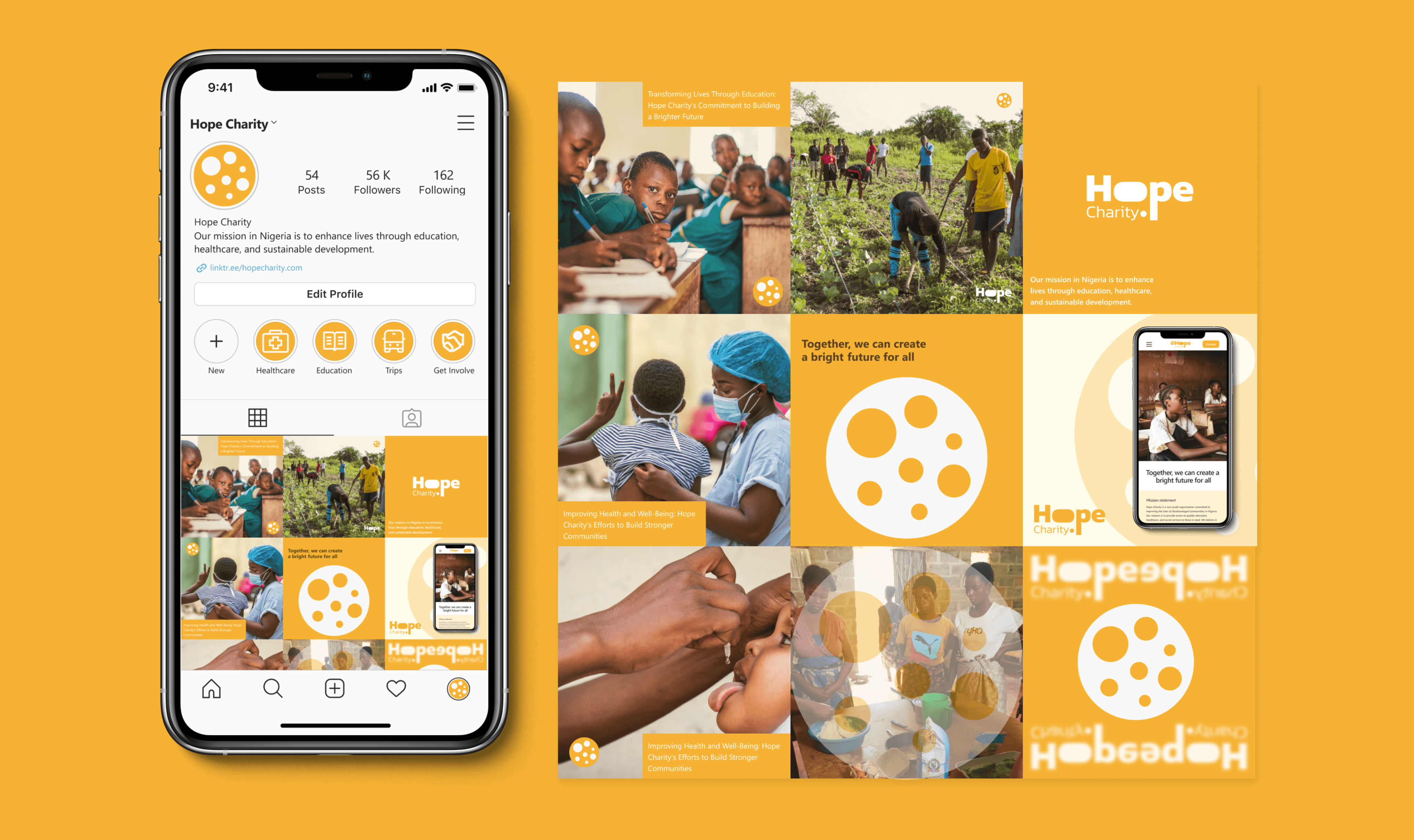
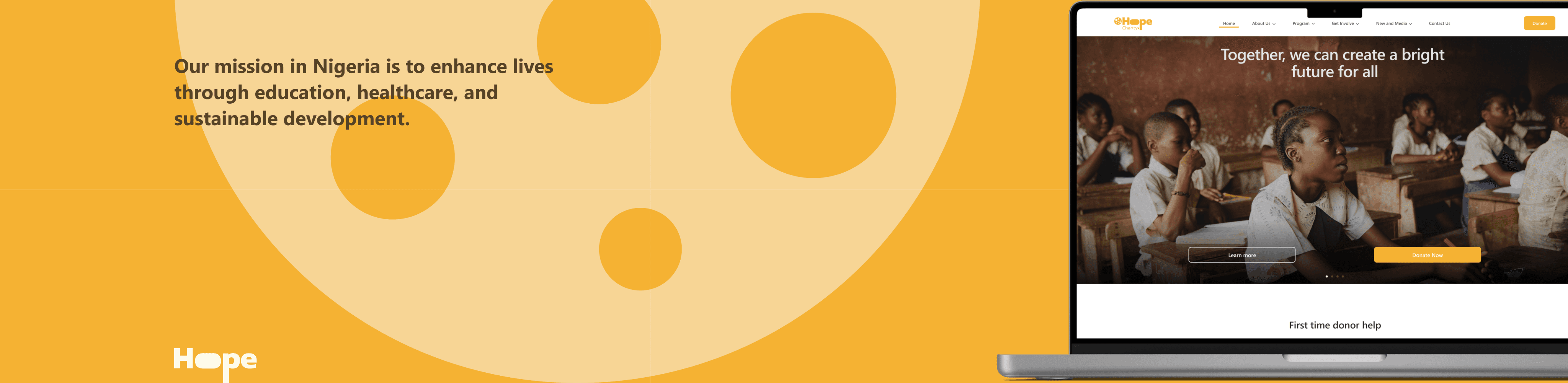
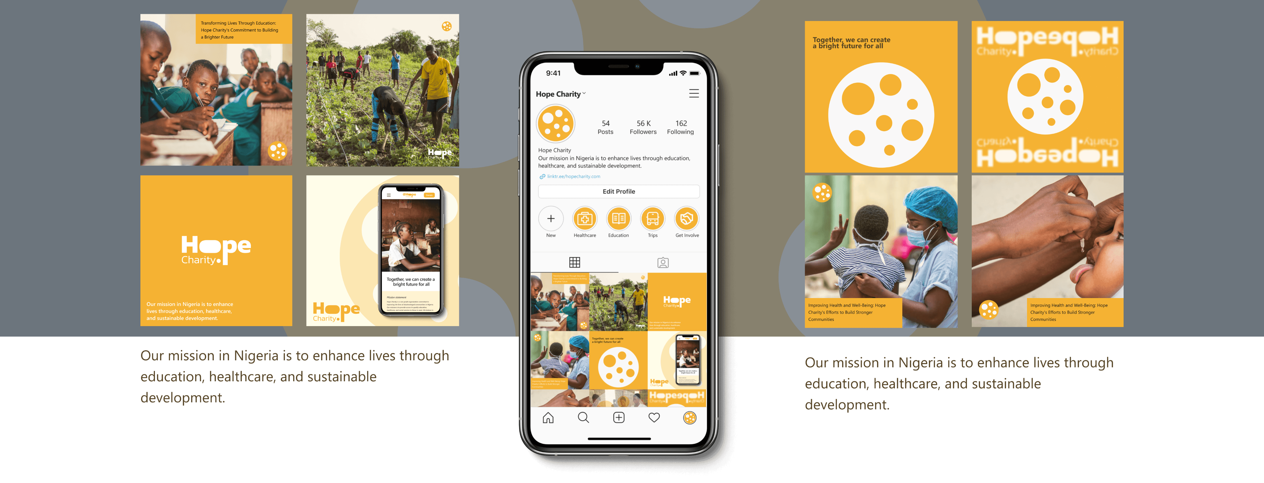
Our mission in Nigeria is to enhance lives through education, healthcare, and sustainable development.
Our mission in Nigeria is to enhance lives through education, healthcare, and sustainable development.
Our mission in Nigeria is to enhance lives through education, healthcare, and sustainable development.
Our mission in Nigeria is to enhance lives through education, healthcare, and sustainable development.
Our mission in Nigeria is to enhance lives through education, healthcare, and sustainable development.
Hope, founded in 2021, aims to improve the lives of disadvantaged communities in Nigeria by providing access to quality education, healthcare, and social services. Despite initial limited resources, the founders have grown and established partnerships with local organizations and community members. Today, Hope is a respected and influential force in the Nigerian non-profit sector, with a dedicated team of staff and volunteers working tirelessly to build stronger, healthier, and more vibrant communities.
Hope, founded in 2021, aims to improve the lives of disadvantaged communities in Nigeria by providing access to quality education, healthcare, and social services. Despite initial limited resources, the founders have grown and established partnerships with local organizations and community members. Today, Hope is a respected and influential force in the Nigerian non-profit sector, with a dedicated team of staff and volunteers working tirelessly to build stronger, healthier, and more vibrant communities.
A series of logotype and mark combined in different way for different thing. These can be switched out depending on purpose and usage
Education
Health
Poverty
Alleviation
Community
development


Client
Hope
Nigeria
Project Scope
Strategy: strategic foundation, market research, objective, goals and creating a brand personality
Visual identity: mood board, type explorations, logotype, Color palette, logomark, color mark, primary type, brand applications
Takeaways
Brand Consistency:
The visual identity brought much-needed consistency to hope charity organization. All marketing materials now adhered to the same design principles, reinforcing the brand's professionalism.
Enhanced Appeal:
The design elements, logo and color scheme, typography, etc, gave hope charity a fresh and appealing look that resonated with users.
Increased Confidence:
The rebrand instilled a sense of confidence within the organization, aligning the team with a clear and unified brand identity
While I couldn't provide specific quantitative metrics, the success of this project was evident in the positive feedback received and the improved visual consistency and appeal. This case study illustrates my problem-solving abilities, design thinking, and commitment to meeting the client's goals
Get in Touch